
Color Samples: The 5 Biggest Mistakes To Avoid
There you are, at the store, staring at a wall of paint color samples in every shade imaginable and simply overwhelmed by the choice. Even if you thought you knew exactly what you wanted, the reality of seeing all of those chips somehow manages to undermine your certainty.
Getting started is often half the battle so we hope you’ll find these tips helpful in getting your project started on the right foot and most importantly — absolutely loving your color choice.
Getting started is often half the battle so we hope you’ll find these tips helpful in getting your project started on the right foot and most importantly — absolutely loving your color choice.

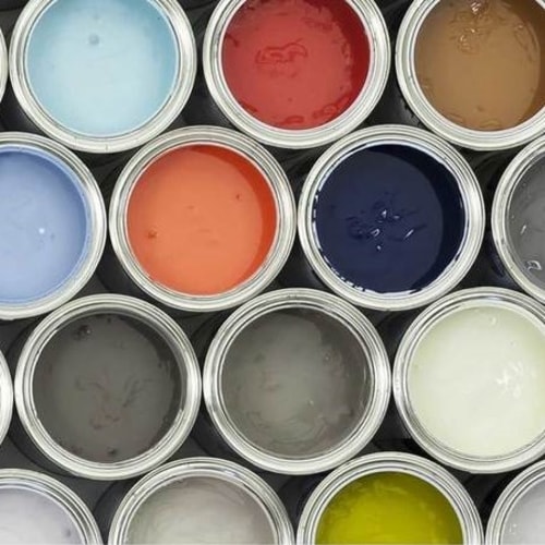
Color sample chips
Mistake #1: Picking a Color Solely From a Chip In-store
First and foremost, you should plan to visit the paint counter at least twice for every project. Why? Because you’ll need to have a few options mixed up in color samples before you decide on the color for the project. Even if you find a chip that you absolutely adore you should still pick out a few alternatives and bring them home with you and compare them in your actual room with the actual lighting. A paint chip viewed in the aisle of your local paint store can’t convey how it will look on all four walls at various times of the day. The same rule applies for a color you have seen used in another home. The exact same paint can look drastically different when used in different settings.Get A Free Color Sample
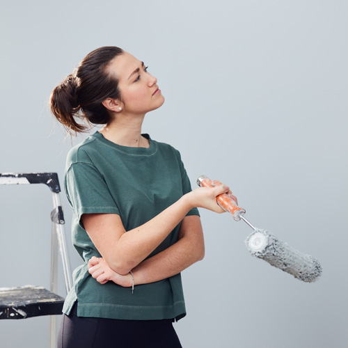
Choosing a paint color
Mistake #2: Only Trying One Shade Per Color
Even within very similar chips, the different undertones can have a big difference. That pale yellow shade that looked perfect on the chip might be too bright on the wall, but if you had tried a similar shade a few chips over, it would have been the perfect butter yellow you imagined. Once you’ve narrowed it down to one or two colors, it’s a good idea to try a few different varieties of those colors so you can pick the perfect one.Launch Room Color Visualizer

Dark paint in Office
Mistake #3: Being Afraid of the Dark
A deep shade can seem scary—it’s often a dramatic change or you might be worried it will make your space seem smaller. Test it! One of the biggest regrets can be putting in all that work just to realize you went too light. For example, most beautiful grays are in the middle or dark ends of the chip—very pale grey paint colors can look a lot like a dingy white once on the wall. Don’t shy away from the darker shades—especially in neutrals, the results can be gorgeous.View Full Glidden Color Palette

Color swatches
Mistake #4: Testing Tiny Swatches
So you heeded the advice and brought home a few color samples to test. Use them! Don’t paint a 5-inch swatch and expect to get the full effect. Cover as much area as you reasonably can so when you decide if the color is right for you, you’re getting a look of it closer to the scale of the final result. Then do a second coat. Big swatches also allow you to get a better sense of what the color will look like under different lights. One shade might look better or worse during the day or night. You really want to kick the tires on this one. It only takes a few more minutes to paint a large swatch instead of a small one, and it’s so worth the effort.Get A Free Color Sample

Paint color samples
Mistake #5: Deciding When the Paint’s Wet
It’s hard to be patient, but a few hours of drying time is absolutely worth the wait. After you have those samples up, let them dry completely before making your final decision. Some paint colors look remarkably similar when dry vs. wet, but some can take on a much different look after they’ve dried. After you’ve gone through the effort of putting up your big swatches, this is no time to rush. Go grab a cup of coffee before you come back, and then pick your favorite.So there you have it—the top 5 mistakes that can easily be avoided when choosing paint colors. Hoping your next trip to the paint counter is a little less stressful.
Find The Right Paint Color